Post 4 - Learning Web Design

After reading these chapters, I was able to have a better understanding of why web layout has evolved and what each tool is designed for. Before reading, I couldn’t really understand Flexbox and CSS Grid. I learned that flexbox works in one dimension at a time, either a row or a column. Whereas a CSS grid works in two dimensions simultaneously, rows and columns at the same time. For me, it’s easier to remember: use flexbox when you want to distribute them along an axis, and use grid when you have a layout with both rows and columns like a full website layout with a sidebar, header, main content, etc.
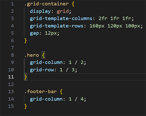
Something I found interesting was the introduction of fr. I learned that it means “fraction of available space”. It’s used when you write grids. For example, when you write grid-template-columns: 2fr 1fr 1fr, you’re telling the browser to divide the width into 4 equal parts, giving the first column 2 of them and giving the rest 1 share each.
To visualize this, I created a quick file to see it in action. The grid style displays the hero area as two rows tall, and the footer banner spans across the three columns.
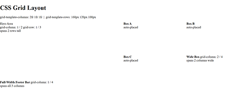
The numbers refer to grid lines not column numbers. Since a 3 column grid has 4 vertical lines, ¼ means from line 1 to line 4, so full width. Writing it out helped me visualize it and understand it even more.