Post 3 - Comparative Analysis

For my interactive narrative, I’m creating a choose-your-own-adventure game where the player has to either solve a mystery or escape a nightmare. I’m still deciding which route to take. Since my interactive narrative depends on the players' choices, I explored other interactive fictions to see their approach and design choices.
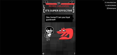
The first website I came across was, itch.io. Itch is a website that allows users to upload their games. Players can play the games directly in their web browsers. I noticed that all of them have different approaches to their designs. One that caught my attention was “Adventures with Anxiety”. It's an interactive choose your own adventure about how anxiety takes a physical form and “protects” their human. I noticed that this game in particular has animations. I believe I won’t be able to achieve that with HTML but even just as images, it looks cool! It’s very simplistic, with the choices being clear buttons and the menus being on the bottom corners of the screen. The only negative I noticed was that it’s only set to fit mobile. It doesn’t switch between desktop and mobile. This is something I have to keep in mind for my interactive narrative.
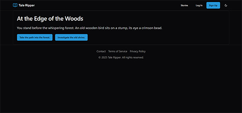
The second website I discovered was taleripper.com. It’s a lot simpler than itch.io, since it only uses words and no images. A negative thing I noticed about the styling is that everything is left-aligned. This makes it uncomfortable for users to read. However, the home page setup is quite clean and minimalistic. Overall, this website was an example of something I don’t want to do. I think it could benefit a lot from centering and adding images that enhance the storyline and users’ imagination.
Looking at these examples helped me learn how I want my interactive narrative to look. I really liked itch.io and how the illustrations and story are the main components and the menu and settings are on the corners of the screen. Overall, this made me realize I have to work a lot on my storyline and illustrations.