
#1 History of Internet
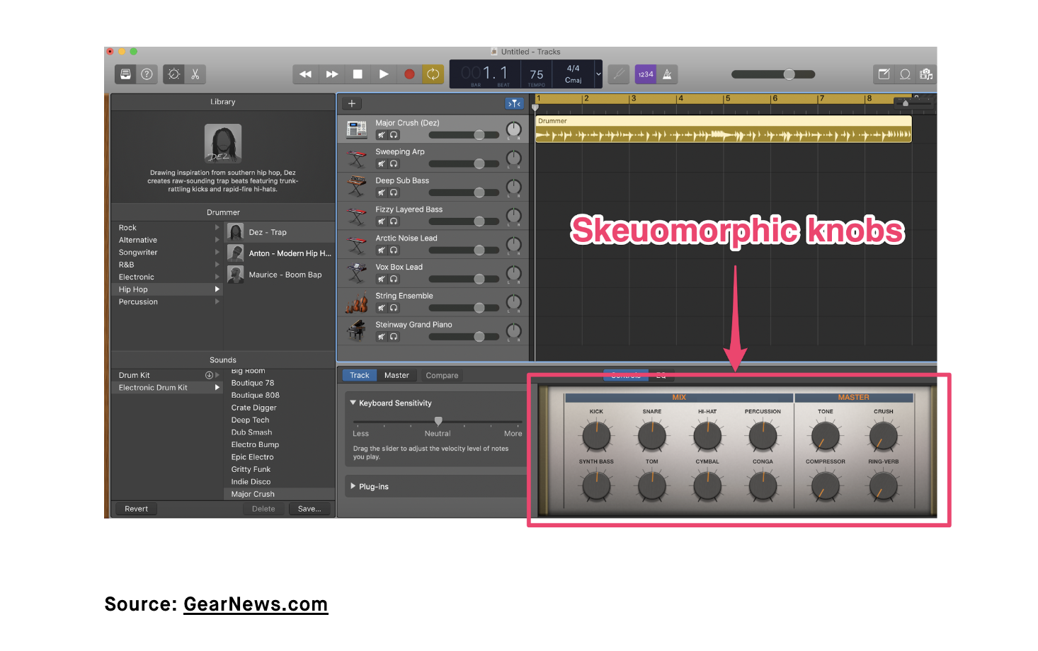
Of all the topics discussed in the history of the internet, I was really interested in skeuomorphism, a term that I had no idea about until now! As explained in class, this term is used to describe interfaces that are designed to look like their real-world counterparts. The visual examples shown in class were from Apple’s earliest iOS. As I researched this topic more, I discovered that skeuomorphism is meant to make interfaces easier to navigate because of their familiar format. There has been some debate about whether skeuomorphism is needed anymore. This made me think about how many interfaces now, including Apple, have transitioned to more simplistic, flat designs over time. On the anti-skeuomorphism side of the debate, the argument is that these designs are not socially relevant anymore and are not the most aesthetically pleasing. Additionally, people can recognize icons and their functions without these complex designs. On the pro-side, it is argued that skeuomorphism in a simplified form can be helpful because as humans, we will always be part of the physical world. Aside from the debate, there is apparently an emerging type of UI design called neumorphism, which is inspired by skeuomorphism and flat design. It can be described as low contrast, soft and simplified realism. Thinking about skeuomorphism definitely brought me back to my childhood, specifically when I got my first iPod touch. Those who had Apple devices at the time can easily recognize the nostalgia-inducing iOS layout. I never really thought about the impact of UI design in this particular way until now and it makes me appreciate getting the chance to see technology progress throughout my life (and not only in Apple devices). I do think there are pros and cons to skeuomorphic and flat designs, but I am very interested in their middle ground– neumorphism which combines the best qualities of both in a creative way.