I also am becoming a complicated tool as I age.
Experimenting with CSS layout techniques
Lessons from "Learning Web Design"
As CSS has developed over the years, increasingly powerful (and complicated!) layout techniques have been incorporated into the language.
The box model is the fundamental CSS layout tool, and is used in all the other techniques. Every piece of content on a webpage has width, height, padding, border, and margin.
Floating still exists but it's pretty outdated both technologically and design-wise. The only reason I could think to use it today would be if you're going for a y2k aesthetic. You can't easily recreate the appearance of floating with the other layout techniques, but why would you want to?
Positioning still has its uses for individual items and is especially useful when getting into CSS animations, but there are better and easier tools now for page layouts.
Flexbox is the current standard tool for page layouts. It's highly versatile, good for responsive design, and easy for incorporating additional content.
Grid is the newest kid on the block. It's good for achieving precise layouts (and recreating Swiss Style, which is popular lately), but harder when incorporating additional content.
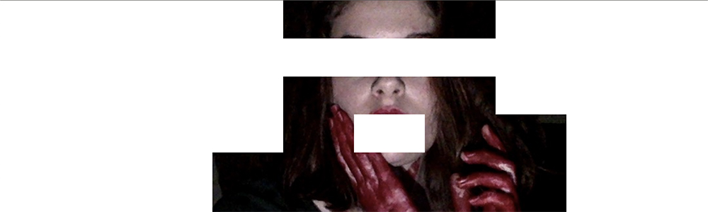
Making a composition
I made the composition in the header image of this post using flexbox and flex-wrap to make a 10x10 grid, and using div backgrounds to obscure and reveal parts of the background image: a photo of me from a few halloweens ago (the blood is not real). I could have also used css grid to create this same effect, but Bill Mead already made an example of that.